
Engineering Consultants / Case Study
From capability to consequence.
Brand Strategy / Visual Identity / Website Design

Concept · Professional Services
Engineered for trust.
01
The Brief
Expertise the clients couldn’t see.
This direction was developed for a women-led civil and transportation engineering consultancy, one of the studio’s first beta engagements. After a discovery session with the founder, I developed the positioning and visual direction shown here. The firm chose to pause before implementation. The work is shown anonymized. I spent twenty years on the client side of infrastructure, reading consultants’ proposals. This direction asks what one of them would look like if the brand carried the same weight as the work.
02
The Challenge
Credentials that spoke. A brand that didn’t.
The firm had a deep record of complex infrastructure work. Its materials conveyed information, but not identity. The direction had to establish trust before a reader reached the qualifications.
01
Invisible Expertise
Deep credentials, with no visual language that matched the weight of the work.
02
Authority, stated once
Women-led firms in engineering are often asked to prove technical authority twice. The direction lets precision make the case, and gives the human side to voice and imagery.
03
A system that scales
Proposals, website, and digital communication, designed to work as one.
"Clarity communicates strength."
Creative Direction
03
The Visual Identity
A palette built for infrastructure — and the people who build it.
The color system was developed to balance the precision of engineering with the warmth of human leadership. Each color carries a specific role across the brand system.
Brand Palette
Deep Charcoal
#2C2C2A
Primary
Construction Orange
#D4622A
Accent
Soft Gray
#E8E4DE
Background
Steel Blue
#4A6FA5
Secondary
Warm White
#F5F2EC
Surface

05
Strategy & Design
Designed for trust before a word is read.
Before visuals were developed, I proposed susbtantive changes to the information architecture to improve clarity and navigation. This formed the foundation for a scalable visual system that unified the website, proposals, and digital communication under a consistent brand identity.
Positioning
Proposes a shift from technical vendor to a trusted infrastructure partner — shifting the narrative from capability to consequence.
Logo
A new mark inspired by bridge geometry — structural, directional, and unmistakably engineered.
Color
An extended palette evolved from the firm's original two colors — adding depth, warmth, and versatility across all touchpoints.
Website
Designed with structure and intention — clear navigation, measured spacing, and modular content frames that reflect discipline.
Tone
A voice that balances technical authority with human accessibility — written for decision-makers who value clarity over jargon.
Photography
Curated imagery that places infrastructure in human context — people, scale, and light working together to communicate trust.
04
The Digital Experience
Designed for every screen, engineered for clarity.
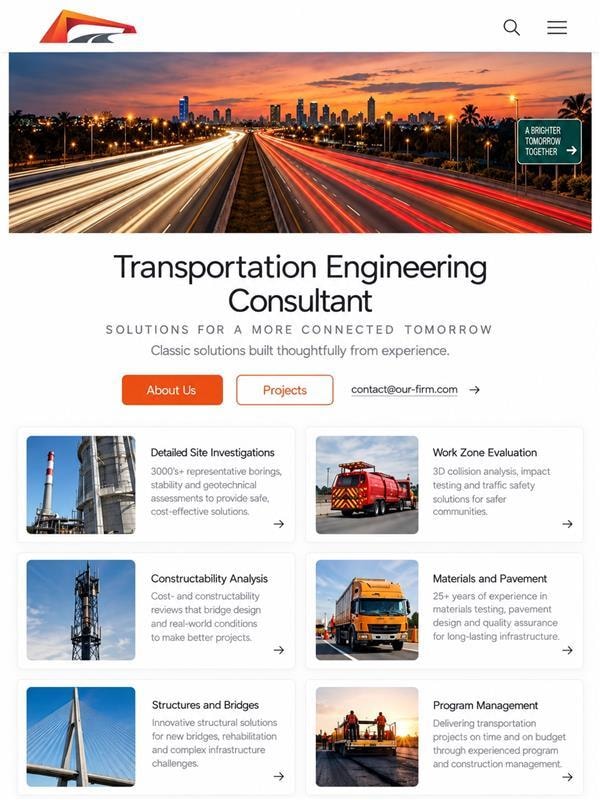
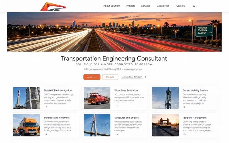
The website was built to communicate the firm's full scope of services across every device — from a desktop project portfolio to a mobile-first service directory.
Digital Experience — Responsive Design System

01
Positioning
Introduce the firm's distinctive perspective.
02
Credentials
Explain the experience behind its guidance.
03
Services
Help visitors find support relevant to their situation.
04
Access
Make it easy to take the first step.
06
The Outcome
What the Direction Proposes
This brand direction reimagines how an engineering consultancy can present itself — not through corporate templates, but through thoughtful design that communicates integrity.
Complete brand identity redesign guided by archetype alignment
New logo inspired by bridge geometry — structural and directional
Extended complementary color palette from the firm's original two colors
Responsive website designed for clarity and trust
Brand voice and messaging framework
Photography direction and image curation guidelines
"The question was whether an engineering firm could look as considered as its work. The answer begins with a bridge arch."
— Cocotasos Creative
Cocotasos Creative
← Back to Work