
Brand in Context
The world Flow Bar Co. inhabits
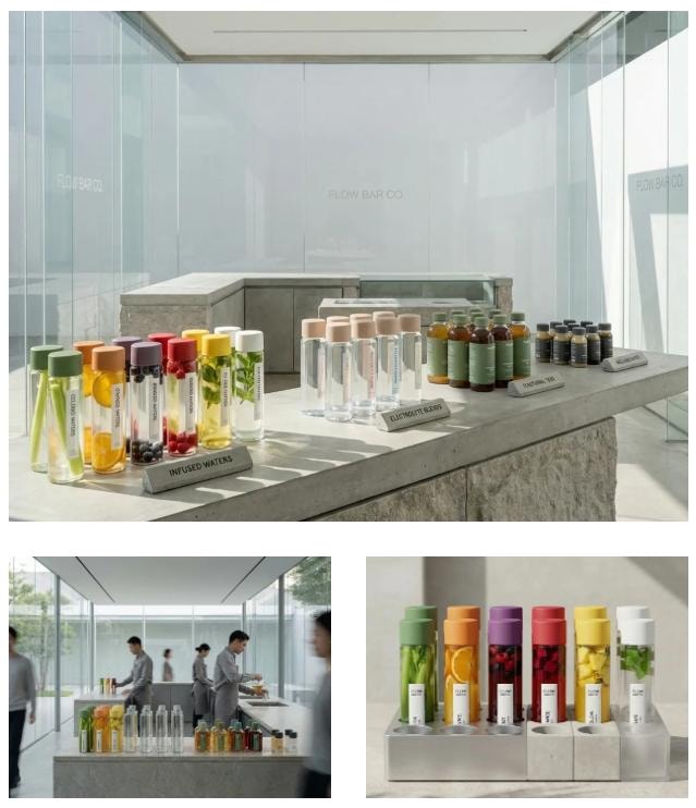

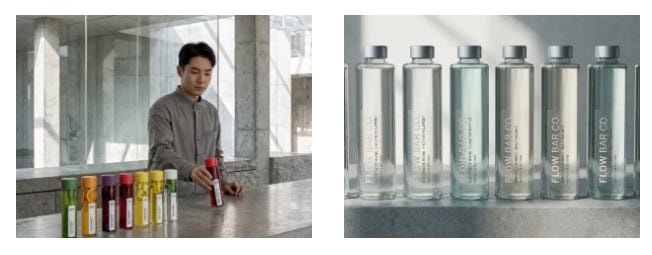
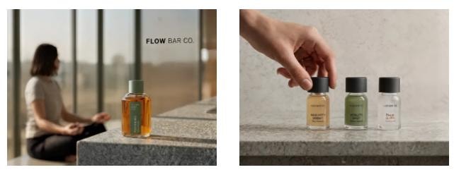
Designed as a modern hydration station, they treat water the way civic architecture treats light, movement, and space — as something essential, shared, quietly considered. The project explores how a restrained visual language elevates hydration from product to public experience.
Services
- Website Direction
- Message Clarity
- Creative Development
Phase
Design
Design Principles
Restraint over expression
Clarity over choice
Integration over visibility
Function before narrative
Longevity as a design constraint
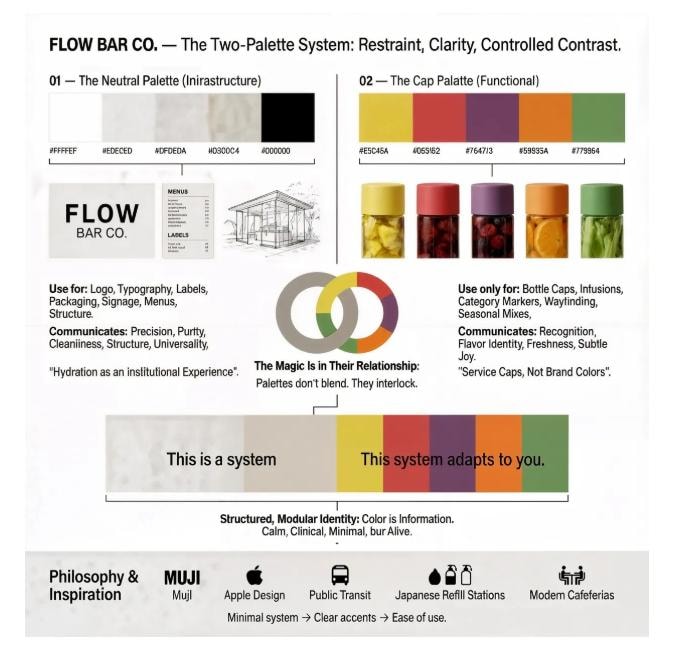
Neutral Palette
Brand Infrastructure
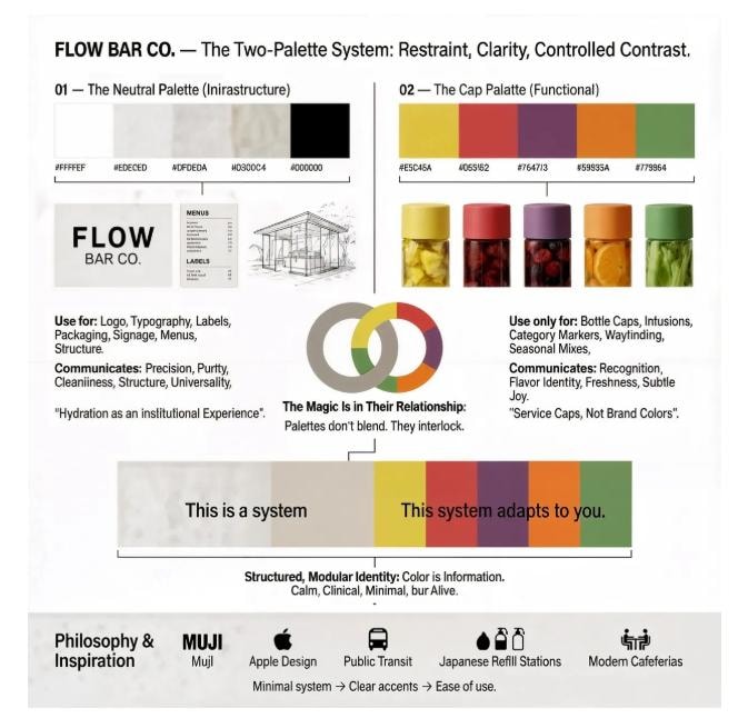
This is the brand's architecture. Its public-utility backbone. Use this palette for the logo, typography, labels, packaging layout, signage, and anything that reflects the system — not the flavor. It communicates precision, purity, cleanliness, structure, and universality. This palette sets the tone: hydration is an institutional experience, not a trendy product.
Used for
- —Logo & typography
- —Labels & packaging layout
- —Signage & menus
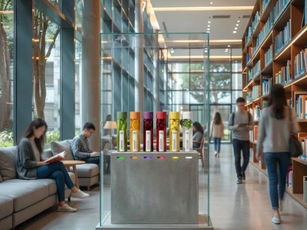
- —The glass pavilion
- —Anything that reflects the system
Cap Palette
Functional Color System
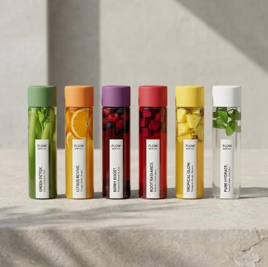
This palette is functional, not decorative. Each color communicates a bottle's content, a category, an ingredient logic, a visual cue for the user. Think of them as service caps — not brand colors. Use these only for bottle caps, fruit and vegetable infusions, category markers, wayfinding inside the hydration station, and seasonal or functional mixes.
Used for
- —Bottle caps
- —Fruit & vegetable infusions
- —Category markers
- —Wayfinding inside the station
- —Seasonal & functional mixes
The Magic Is in Their Relationship
These palettes don't blend. They interlock. The neutral palette says: 'This is a system.' The cap palette says: 'This system adapts to you.' Together, they create a structured, modular identity where color is never decoration — it is information. This is why Flow Bar Co. feels institutional but also alive.
Neutrals dominate → the brand stays calm, clinical, minimal. Caps punctuate → each bottle stands out without visual noise. This lets the bottles feel like part of a public hydration network, not a flavored water brand.
Reference systems
The Use of Color
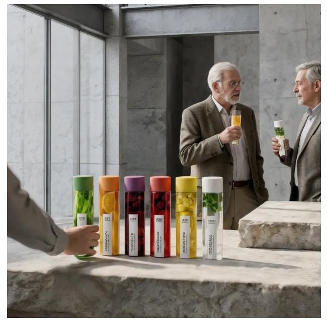
Flow Bar Co. uses color as a functional signal within its hydration system. Color does not define the brand; it clarifies the offering. Flow Bar Co. works like a museum exhibition system. The Architecture speaks in silence. The Product speaks in color. Color never labels the brand. Color labels the function.
The Impact
Even as a conceptual project, this direction reflects what clarity-led design achieves.
Confidence in communicating the mission
Structure that simplifies decision-making
A design system rooted in purpose and trust
A clearer path for community support
The result is a visual presence that honors the utility of hydration while presenting the brand with strength and intention.
Credits
Brand Strategy & Creative Direction
Anabel Aliferis
Cocotasos Creative — Where structure meets soul.